
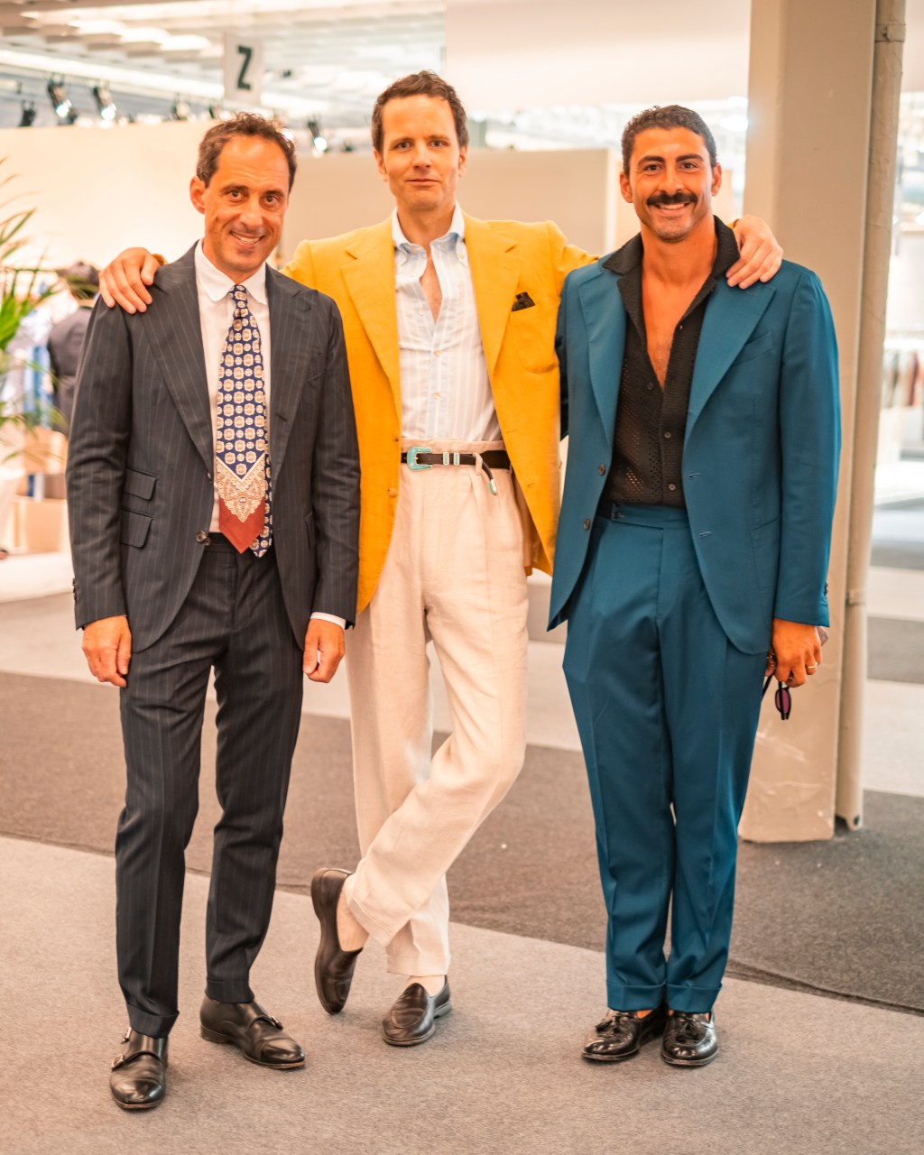
Part I – Colours
Matching clothes is a science in itself. For some, it comes naturally. A creative eye can often tell which colours and garments work together without consulting guides or inspiration boards. But even those with a good eye can benefit from understanding the basic principles of matching.
It’s not something that can be taught in a single sitting. There are simply too many aspects to consider, from colour and texture to proportions, patterns and formality. So, let’s start with perhaps the most straightforward lesson of all: how to combine colours.
Different Colours for Different Seasons
This probably won’t come as news to anyone with even a passing interest in clothing, but let’s start by breaking things down into their essentials: spring/summer and autumn/winter colour palettes.
As the days grow longer and brighter, you don’t just want to shed a few layers. Your clothes and accessories can also reflect the lighter, brighter colours of the season.
The opposite generally applies to autumn and winter, when the changing landscape provides an excellent excuse to introduce deeper, earthier and more muted tones.
Of course, there are no absolute rules here. A pale jacket can look just as good in October as it does in June, provided the wearer feels comfortable in his clothes. But seasonal palettes are a useful starting point.
Since we’re concentrating on colour, we’ll keep things relatively simple and focus primarily on solid-coloured garments.
Who Are You?
This is perhaps the most important question you can ask yourself. Not just for existential reasons, but also when deciding how to dress.
Different approaches to colour tend to reflect different styles, environments and, to some extent, personalities.
To make things easier, we’ve divided our spring/summer palettes into three categories: Preppy, Mediterranean and Northern. For autumn/winter, we’ve chosen Ivy, Mediterranean and Northern.
These aren’t strict geographical definitions or rules that need to be followed. Think of them as different approaches to building a wardrobe, each with its own characteristic colours and combinations.
Preppy – Spring/Summer
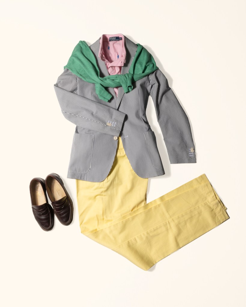
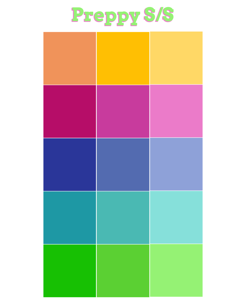
The preppy summer palette is a mixture of bright and washed-out colours. Think salmon, pink, yellow, blue, green, red and just about every other cheerful shade you can imagine.
It’s playful, youthful and full of life.
And it’s easier to match than you might think. In fact, many of these seemingly competing colours work remarkably well together.
Forget ridiculous old rules like “blue and green should never be seen”. Done right, the combination looks fantastic.
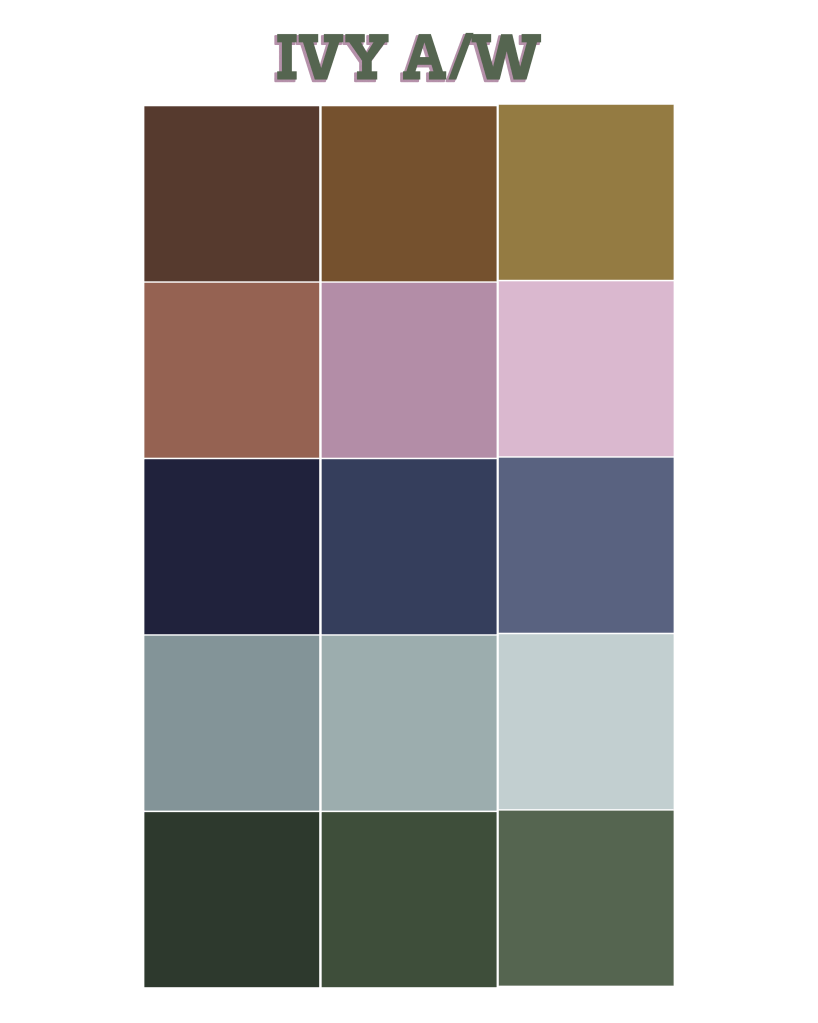
Ivy – Autumn/Winter
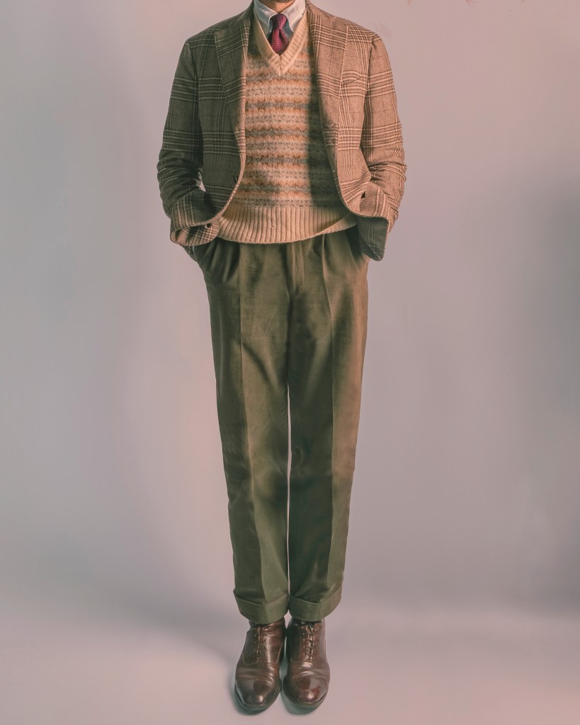
Ivy style can be seen as the slightly more grown-up relative of preppy, although the two share much of the same vocabulary.
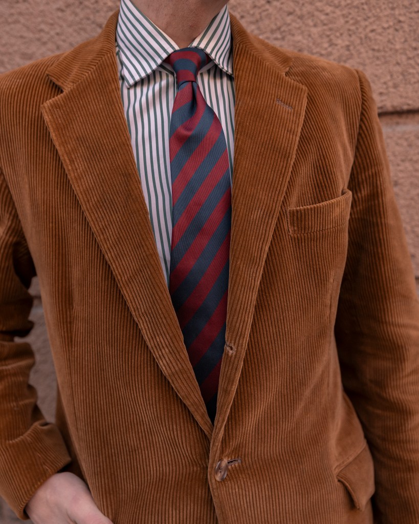
The colours tend to be somewhat more restrained, particularly during autumn and winter, when moss green, brown, burgundy, rust and burnt orange come into their own.
These shades work particularly well with traditional materials such as tweed, corduroy, flannel and wool knitwear.
The trick is to combine a relatively muted foundation with the occasional unexpected colour. A burgundy tie, an orange Fair Isle knit or a pair of green corduroy trousers can bring an otherwise conservative outfit to life.
Northern – Spring/Summer
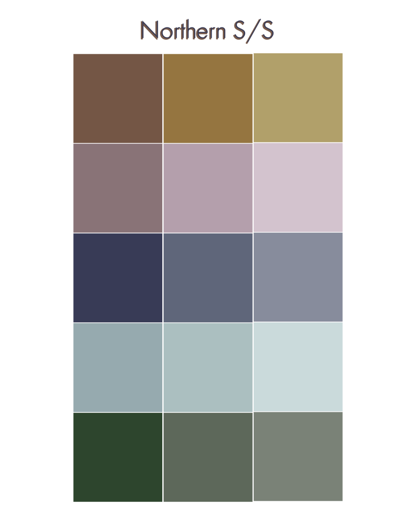
Although we’re calling this the Northern palette, its appeal extends well beyond the Nordic countries.
The minimalist approach to colour that has become associated with Scandinavian design has spread far and wide, and it’s easy to understand why.
The idea is simple: combine light, neutral and relatively desaturated colours to create an understated, harmonious look.
Think beige, taupe, off-white, muted sage green, pale grey and soft blue.
It’s generally a safe and uncomplicated way of dressing, but that doesn’t make it boring. Quite the opposite. The subtle differences between shades can create surprisingly interesting combinations.
Another advantage is that these colours tend to work well on a wide range of people.
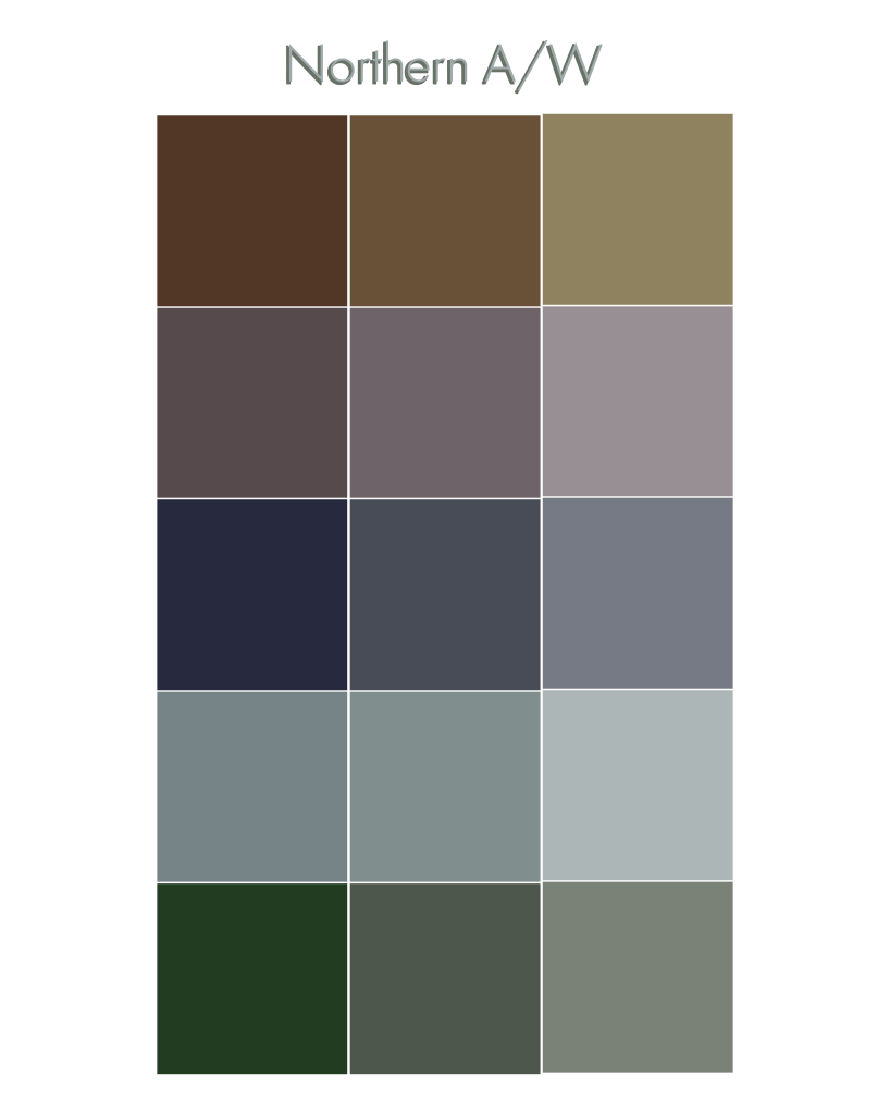
Northern – Autumn/Winter
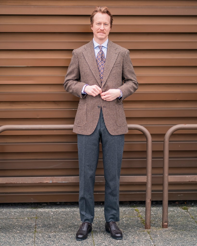
To be perfectly frank, much of the Northern spring/summer palette works just as well during the colder months.
The main difference is that autumn and winter allow you to introduce slightly deeper shades.
Swap pale beige for camel, light grey for charcoal and sage green for olive. Brown, taupe and muted blues remain excellent choices throughout the year.
This approach also lends itself particularly well to combining different textures. A chunky wool jumper, flannel trousers and a brushed overcoat can all be relatively similar in colour without the outfit looking flat.
In fact, when working with a restrained palette, texture often becomes just as important as colour.
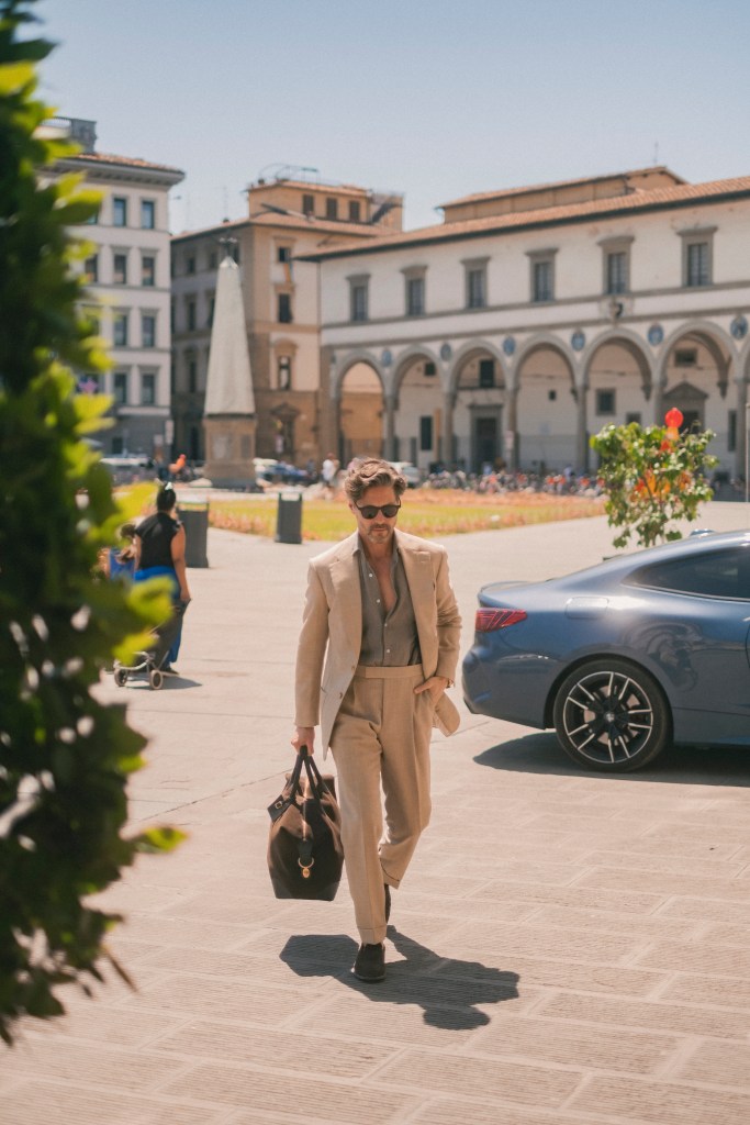
Mediterranean – Spring/Summer
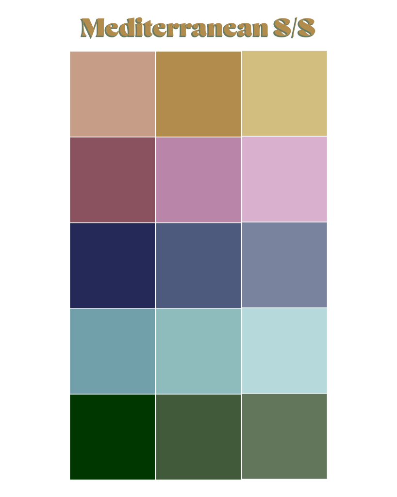
Perhaps no approach to summer dressing has been copied quite as enthusiastically as the Mediterranean one.
And why not? Italians and other inhabitants of the Mediterranean have had plenty of practice dressing elegantly in warm weather.
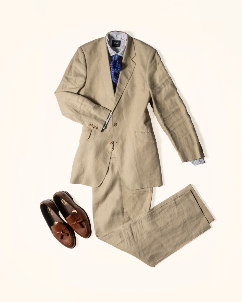
The foundation is often surprisingly restrained: white, cream, beige, pale brown and different shades of blue.
What makes the look interesting is the willingness to introduce a more expressive colour into an otherwise relatively simple outfit.
A green shirt with an off-white suit, a colourful knitted polo beneath a beige jacket or a pair of bright trousers worn with an understated shirt.
The combinations can be bold, but rarely feel particularly forced.

Mediterranean – Autumn/Winter
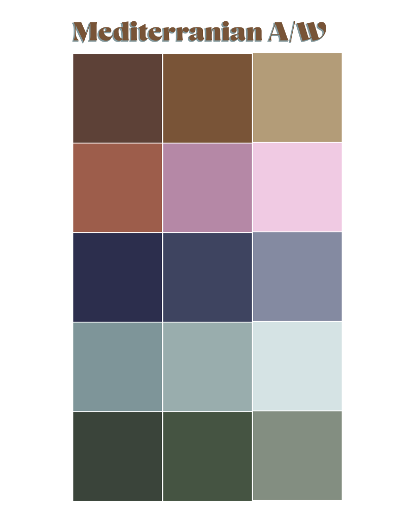
Many of the same principles apply to the Mediterranean autumn/winter wardrobe.
The palette becomes slightly darker and richer, but the willingness to experiment with colour remains.
Think tobacco brown, olive green, burgundy, cream and different shades of blue, often combined in ways that might initially seem unconventional.
A brighter blue jacket instead of the expected navy, for example, or a burgundy knit beneath a brown overcoat.
The result is often subtle at first glance, but there’s usually something that sets the outfit apart.
That small element of individuality is perhaps the most recognisable feature of Mediterranean dressing, regardless of season.
Neutral Colours – The Foundation of a Versatile Wardrobe
Not quite ready to experiment with salmon trousers or a bright green shirt?
Start with neutrals.
A wardrobe built around a few versatile colours gives you an excellent foundation for experimenting with more expressive combinations later on.
The beauty of neutral colours is that they rarely demand much attention themselves. Instead, they allow other elements of an outfit to take centre stage.
And while there are plenty of colours that could be considered neutral, three groups are particularly useful.
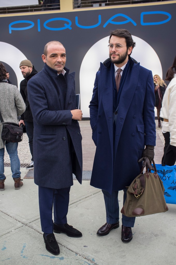
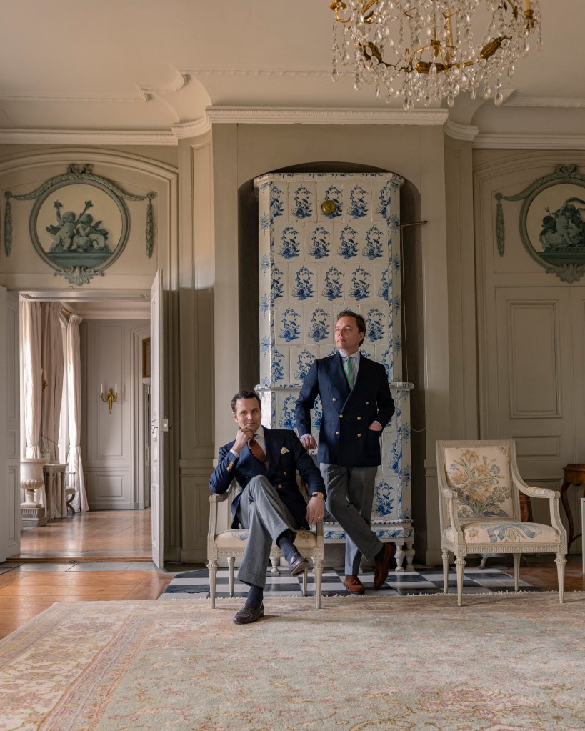
Navy
Few colours are as versatile as navy.
It complements most complexions, works throughout the year and is equally at home in casual and formal wardrobes.
A navy suit, a navy sport coat or a simple navy jumper can provide the foundation for countless combinations.
It also gives you the freedom to be slightly more adventurous elsewhere. A colourful tie, a patterned shirt or a pair of lighter trousers can all work beautifully against a navy background.
If you’re building a wardrobe from scratch, navy is one of the safest places to start.



Grey
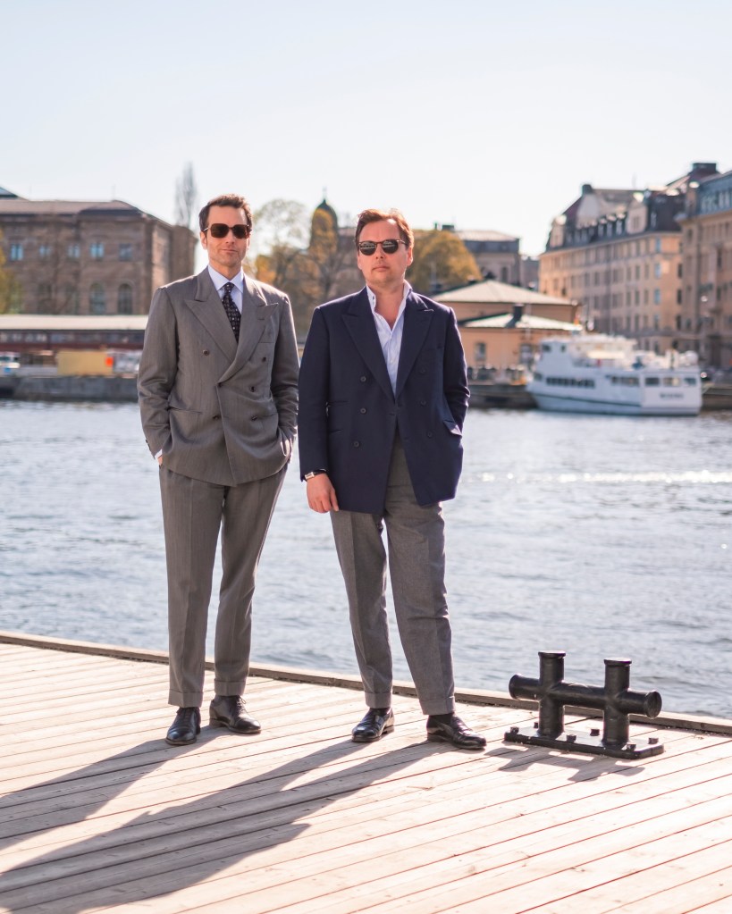
It doesn’t really get much more neutral than grey, does it?
It’s particularly well suited to suits, trousers, knitwear and outerwear, and its versatility is difficult to overstate.
Because grey is so restrained, it allows you to experiment with colours that might otherwise be difficult to combine.
A pair of mid-grey flannel trousers, for example, can work with almost anything from a navy blazer to a burgundy jumper or a brown tweed jacket.
Alternatively, you can embrace the neutrality and create an entirely tonal outfit using different shades of grey.
The result can be wonderfully understated, provided you introduce enough variation in shade and texture.



Shades of Brown and Beige
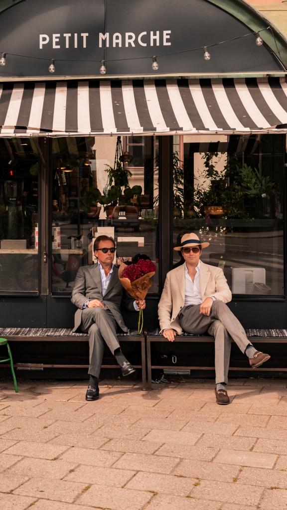
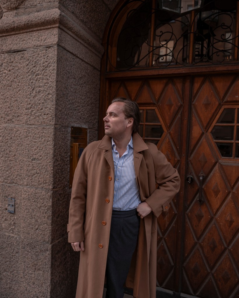
Brown, beige and taupe have arguably been among the most popular colours in Nordic menswear over the past decade.
And for good reason.
Beige and taupe convey a sense of restraint and refinement, while darker shades of brown can give an outfit a slightly more intellectual character, particularly when worn in corduroy, tweed or suede.
These colours are also remarkably versatile.
Brown works beautifully with navy, grey, green and burgundy, while lighter shades such as beige and cream provide an excellent foundation for both summer and winter outfits.
One of the most appealing things about this colour family is how easily the different shades can be combined with one another.
A cream knit, taupe trousers and a dark brown suede jacket, for example, create an interesting outfit without introducing a single particularly strong colour.


Putting It All Together
So, where should you begin?
One of the easiest ways to approach colour matching is to start with two or three colours that you know work well together and build from there.
Navy and grey. Brown and cream. Olive green and beige. These combinations are difficult to get wrong and provide plenty of room for experimentation.
Once you’re comfortable with the basics, try introducing a more unexpected colour. It doesn’t have to be particularly dramatic. A burgundy tie, a pale pink shirt or a pair of rust-coloured trousers can make an otherwise conventional outfit considerably more interesting.
It’s also worth remembering that colours don’t exist in isolation. The same shade of green can look entirely different depending on whether it’s paired with cream, navy or brown. Materials and textures can change the impression just as much.
And don’t become too attached to the seasonal or geographical categories we’ve discussed. They’re useful references, not instructions.
Ultimately, the most interesting combinations often come from borrowing a little from different approaches. A restrained Northern wardrobe can certainly accommodate a Mediterranean splash of colour, just as an Ivy-inspired outfit can benefit from a more minimalist approach.
The important thing is to develop an eye for what works, rather than memorising a collection of arbitrary rules.


Leave a Reply